
You’ve found it. The design. It’s been saved in your camera roll for weeks, you’ve shown it to exactly one trusted friend, and you’ve finally picked the spot: wrist, maybe, or ribs. Then, right as you’re about to book, someone online mentions the 1/3 rule, and now you’re spiraling, because what if there’s a whole system you don’t know about and your wrist is about to become a cautionary tale?
Here’s the honest starting point: nobody actually agrees on what that phrase means. I went looking for the official version and it isn’t there. What I can give you is better than a commandment, though. It’s the reason sizing rules exist at all, a method for sizing any design on any spot, and the exact moment in the studio when you can still change everything for free.
Key Takeaways
A 2 mm gap between tattoo elements stays readable as the years pass; a 0.5 mm gap is the first to disappear.
Size a tattoo from its finest detail: ask your artist what line weight that detail needs, and if the piece comes out too big, remove detail instead of shrinking the whole design.
The stencil is your last free decision: it can be lifted off and reapplied as many times as you like before any needle touches your skin.
Table of Contents
What the 1/3 rule tattoo actually is (and the four things it gets confused with)
The 1/3 rule, as people use it, is a proportion guideline: a way of thinking about how a tattoo’s elements, spacing, and scale relate to the patch of body it sits on. And I want to be straight with you about the rest, because I went looking for the manual too. There’s no codified industry standard called the 1/3 rule, no founding document, no official origin story. It’s a working guideline that circulates among artists and clients, and that’s genuinely all it is.
Part of the confusion is that the phrase gets borrowed for at least four different ideas. One is the rule of thirds from art class, you divide a composition into thirds and put the interesting stuff on the lines. There’s the sizing method where the smallest detail you want to keep distinct determines the whole tattoo’s size (that’s the useful one, and it gets its own section below). There’s the spacing version, a minimum breathing room between elements so they don’t merge as the tattoo ages.
And there’s a tonal version floating around, the claim that a tattoo should be one-third black, one-third midtone, one-third open skin. That last one shows up constantly in AI-generated answers and I can’t verify it anywhere credible, so treat it as rumor.
The closest thing to a real, documented “thirds” idea in tattooing is the rule of thirds for placement: splitting a body part into three chunks, top, bottom, and elbow, when you’re planning big work. That one gets its full treatment later.
Why proportion rules exist: how tattoos age under your skin
Here’s the whole story in one sentence: over the years, the lines in a tattoo widen slightly and the gaps between them close by the same amount. Once you understand why, every sizing rule in this article stops being an arbitrary commandment and starts being something you can derive yourself.
Tattoo pigment doesn’t float loose in your skin. It gets held inside immune cells in the dermis, the deeper layer of skin, called macrophages. Think of them as patrol cells whose job is to grab foreign particles and hold them. When tattoo pigment arrives, they pick it up and keep it.
But cells don’t live forever. When a macrophage dies, it releases the pigment, and new cells come along and recapture it. This handoff repeats for as long as the tattoo is in you, and researchers have actually traced the cycle; work published in the Journal of Experimental Medicine documented the capture, release, and recapture loop. The catch is that every handoff lets the pigment drift a tiny bit sideways.
Multiply that tiny drift by years and you get the aging pattern: lines widen, gaps narrow. The numbers that matter are these. A 2 mm gap between elements stays readable over time; picture the width of a fingertip’s edge and you’ve got it. A 0.5 mm gap is the first to disappear as the lines spread into it.
Tattoos also expand underneath the skin over time, which is why very small tattoos can merge into a black blob while slightly larger pieces hold up better across a 5-10 year horizon, even with thin lines, down to something like a three round liner, which is one of the skinniest needles there is.
There’s a moment artists describe so often it’s basically a genre: someone brings in a beautifully detailed design and asks for it at wrist size, and the artist has to explain that all those fine gaps will close into a dark patch waiting to happen, then offer a simplified version instead. It’s not gatekeeping. It’s the same math.
How to actually size a design: start from the finest detail
The size that matters isn’t how big the piece should look. It’s the size below which the design stops working. Here’s the procedure, and it’s genuinely something you can run in a consultation.
- Find the finest detail the design depends on. Not the prettiest part, the smallest one that has to stay distinct for the design to read. A whisker, a letter, the gap between two petals.
- Ask your artist what line weight they’d draw that detail at. Line weight is just how thick the line is. This is a completely normal question to ask, and artists answer it all day.
- Let that line weight set the overall dimensions. If the finest detail needs a certain line to survive, the whole piece has to be big enough for that line to hold. The detail dictates the size, not the other way around.
- If the resulting size doesn’t fit your spot or your budget, remove detail. Don’t scale the whole thing down. This is the counterintuitive part, so let it land: shrinking keeps every proportion, including the ones causing the problem. A simplified design at small size ages well. A detailed design shrunk small is the dark patch from the last section.
Quick test: Name the smallest detail that must stay distinct. If the spot can’t fit the line weight that detail needs, simplify the design instead of shrinking it.
The mismatch has a perfect image: it’s a mural on a Post-it note. Same painting. One of them works.
Style matters here too. Bold-outline work tolerates smaller sizes that fine-line work doesn’t, because a thick outline can shrink a long way before its gaps close. If you don’t know which camp your idea is in, that’s a good second question for the artist.
Digital drawing has quietly changed this stage too: on an iPad, a design can be drawn for the exact part of the body it will live on, which makes area-specific fitting part of the design process itself.
And know that artists don’t just execute ideas, they fix them. The classic case is someone arriving with ten reference images and a request for twenty elements crammed into a wrist tattoo. A good artist will sort what actually matters, cut what doesn’t, and nobody leaves embarrassed. Same instinct applies to the obvious mismatches: a Japanese dragon was built for back pieces and full arms, not wrists, and a dragon fighting a tiger back piece simply cannot fit on a forearm.
That’s not criticism. That’s physics.
When the design doesn’t fit the area: change the design, not the size
Shrinking is the one fix that guarantees failure, because scaling down preserves the exact proportions that didn’t work in the first place. The mini version still doesn’t fit; it’s just smaller about it. Redesigning is the opposite move: rearrange the elements, change the direction or proportions, drop a secondary part, or pick a better-suited surface, and the same design can actually work where it is.
The real options, when a design’s proportions don’t suit a placement: rearrange the elements, change the direction or the proportions, remove a secondary part, develop different edges, or choose a better-suited surface. Any one of those can rescue a design that scaling would doom.
The geometry example makes this visible before you ever sit in a chair. A square or circular composition drawn on flat paper sits badly on a cylindrical limb like a forearm. Your body isn’t a flat sheet of paper, and a design pasted on as if it were will shorten, widen, distort, or wrap part of itself around where you can’t see it. This is a common mistake, and it’s describable entirely by geometry: nobody planned badly, the surface just isn’t flat.
Good artists redraw designs for the limb. That’s their job, and it’s a relief, not an insult to your inspiration photo.
Applying it to the spots women actually choose
Each spot has its own sizing verdict, and this is the part no placement article actually lays out, so let’s go area by area.
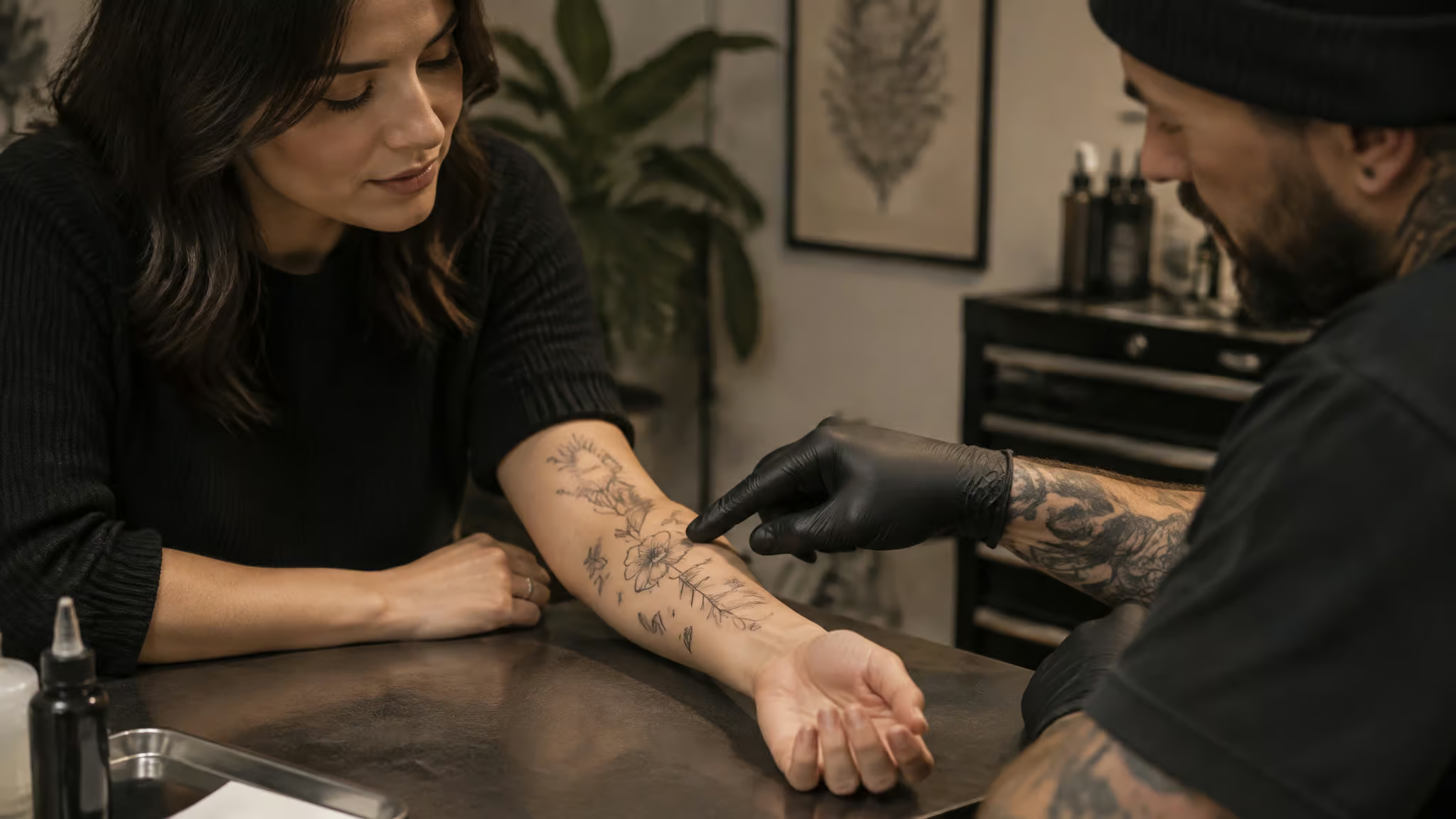
The four constraints that decide most placements. Three of them are about what your skin does, and only one is about how things look to other people:
- Friction and cell turnover. Hands, fingers, feet, and the inner lip hold pigment worst and usually need touch-ups. Outer forearm and outer thigh are the forgiving ones.
- Sun exposure. UV breaks down pigment, and forearms, hands, neck, and calves fade fastest. The sunscreen habit matters more than the anatomy you picked: a forearm worn with sunscreen outlives a shoulder without it.
- Movement and curvature. Elbows, knees, ribs, and the inner wrist distort designs as the skin stretches, and symmetrical or geometric pieces suffer most. Flat planes like the back, outer upper arm, and thigh keep drawings intact. High-friction spots, hands, feet, fingers, fade or blur faster, so fine detail there won’t stay crisp.
- Visibility. Hands, neck, and forearms show at most jobs; upper arms, back, and thigh don’t. This is the only one of the four you can still reverse before the appointment, which makes it worth sitting with. It’s also where trends bite: a viral Z tattoo trend turned out to be possibly a Nazi symbol, the kind of thing you want to know before it’s on your neck.
And visibility is real enough that tattooers live it themselves. Brandon describes having Job Stoppers all over his own body.
Pain is an overlay, not a ranking. Fleshy, muscular areas hurt less; spots over bone or near nerve endings hurt more. Forearm, upper arm, and calf are the easier seats. Rib cage, spine, and elbows suit a higher pain tolerance. That’s the whole chart.
Bodies change, warmly noted. Weight changes hit the stomach, ribs, lower back, breast area, under the bicep, and inner thighs hardest, and pregnancy can affect lower stomach, hip, and belly-button tattoos. If a big weight change is planned, it’s completely fair to delay tattooing those areas; that’s practical patience, not discouragement. And the good news: new tattoos can be applied over stretch marks.
The stable planes. Upper back, shoulder, outer thigh, and outer forearm are where crisp, long-lived detail lives.
Two verdicts worth naming. Ribs and sternum are private, high-pain, and curvature-limited, which suits them to quotes, florals, and geometric work. Wrist and fingers are subtle but high-friction and openly hostile to fine detail.
How big are we even talking? Real-world anchors, because “small” means nothing without a reference:
| Tier | What it means | Where it fits |
|---|---|---|
| Small | About 1 cm up to palm-sized | Wrist, ankle, behind the ear, hip, lower spine, tops of feet, calf, shoulder, chest, back of the neck |
| Medium | Palm-sized up to filling a whole area | Full shin, knee area, inner and back thigh, lower stomach, full sternum piece, upper half sleeve including inner bicep, full chest piece, sides of the neck |
| Large | Sleeve-scale and beyond | Arm sleeve, three-quarter sleeve (shoulder to halfway between elbow and wrist), full leg sleeve (hip to ankle or toes), full front torso, full back piece |
Both paths to large work are legitimate: a tight patchwork of small tattoos built over years, or a piece designed start-to-finish. If you’re still at the collecting-ideas stage, the feminine tattoo ideas hub pairs designs with meaning and placement notes so you’re choosing with all of this in mind.
Beyond one tattoo: how proportion thinking scales to a sleeve
Proportion rules scale up, and this is where they get genuinely three-dimensional. Fair warning: you don’t need any of this for a wrist tattoo. It’s for sleeve dreamers.
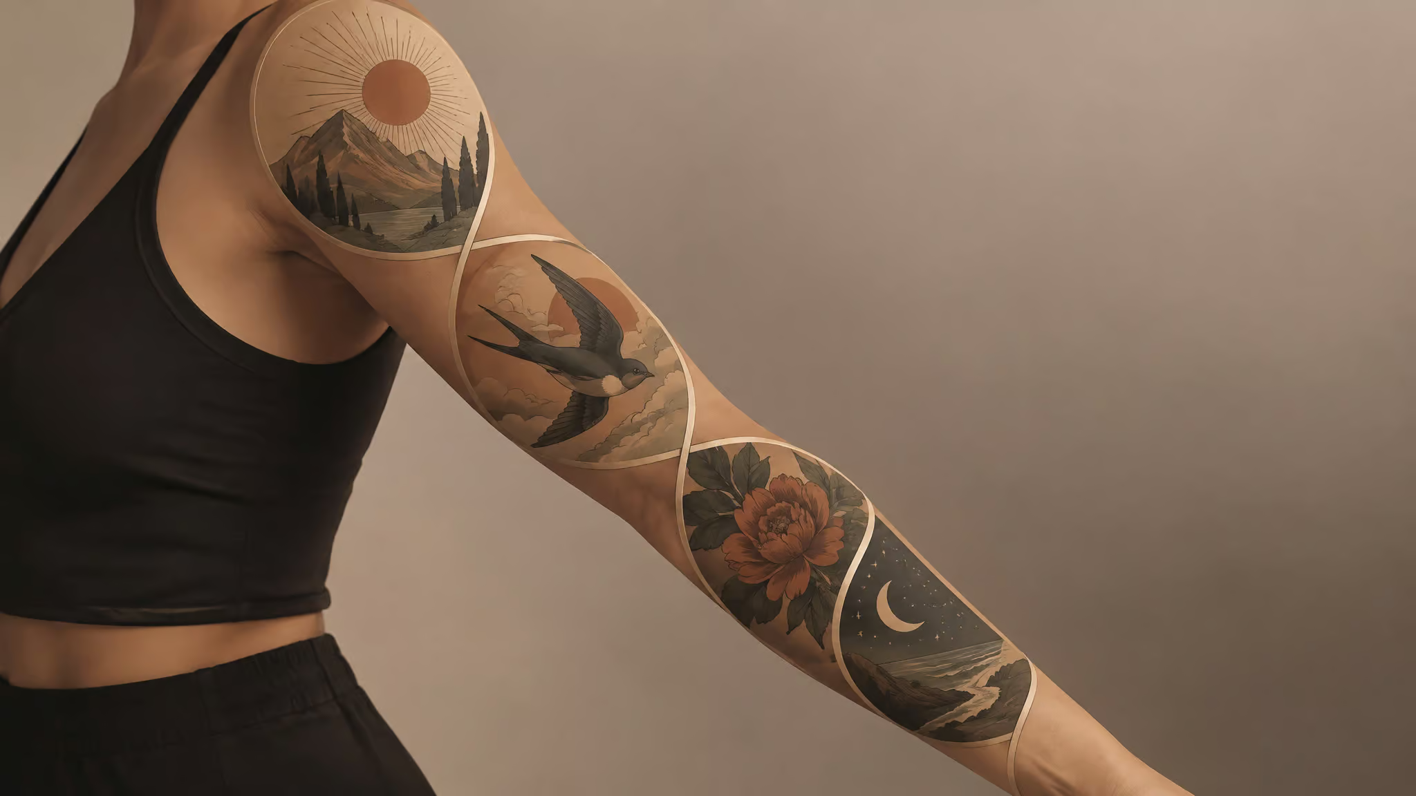
One experienced tattooer’s methodology, which is worth knowing precisely because it isn’t an industry standard, starts with the rule of thirds for placement: split a body part into three chunks, top, bottom, and elbow. A standard stencil gets divided that way, and it works for some designs. But splitting over the elbow creates two pieces connected across a spot tattooers genuinely don’t love working on, and it fails for large storytelling pieces, treat the arm like a flat canvas and you end up with a totem pole, all the detail stacked on one side. The fix is thinking in four spaces instead of three chunks, each with its own focal point.
The smarter alternative thinks in 3D. The arm divides into four placement spaces: front, back, inside, outside. Each space should have one focal point, the way every room needs one thing your eye lands on first. The segmentation points fall where the forearm muscles overlap and just below where the bicep bends, and the dividing line bends around the body like a figure eight, following the tricep up top and loosening toward the bottom. Inside the arm, the segmentation runs almost opposite the standard lines, and the wrist transition matters most there. What mastery looks like, eventually: a single figure spanning quadrants, hand and head in different spaces, body wrapping around, one element spinning toward the inside, another pulling off the back.
Flat thinking fails in recognizable ways. The totem pole effect is what happens when all the detail lives on the outside of a flat sleeve template: from any other angle, that’s exactly what it looks like. Sleeves that skip the elbow read as two disconnected parts. Patchwork gaps get stuffed with asterisks, stars, and smoke, which you have absolutely seen in the wild. And thin filler like daggers ends up where viewers have to contort to see it.
The elbow question is a real debate. Splitting a stencil along the tricep and down the back of the forearm past the elbow creates two areas under constant compressive and elastic stress, which in plain English means skin that gets squeezed and stretched every single time you bend. Segments done at different sessions also age at different rates and never quite look like they belong together. On the other hand, leaving elbows out makes a sleeve look disconnected, and experienced tattooers incorporate them deliberately.
Both things are true. And as a caveat to all the avoid-elbows guidance: friends who are comfortable tattooing elbows do it anyway.
Then there’s the ten-year tail. Today’s proportion choice either reserves or destroys tomorrow’s canvas. Ask any shop and you’ll hear some version of this: a first-tattoo client picks an arm band from the books. Years later they want a full sleeve and have to cover or work around that dark band on the bicep. Or a traditional rose placed mid-arm that clashes with the neo-traditional full sleeve she eventually wants.
This is why consultations should cover long-term goals: leaving smoke or water backgrounds open so a half sleeve can extend into a full one, checking even standalone pieces against possible future projects, and using the whole upper arm if a half sleeve is the plan. A squeezed first piece is the sad version of a good idea.
Rules, conventions, and decisions you’re allowed to make
Most tattoo rules are conventions, not laws. The real ones come from readability, anatomy, or movement problems, which is why they persist.

Crossing a joint isn’t automatically wrong, though; joints can connect big compositions. The real problem is that bending skin can swallow, warp, or shift the parts of a design that need to stay stable. Faces, eyes, text, and key symbols deserve the stable real estate, placed carefully relative to joints.
Conventions often work but aren’t compulsory. Faces get directed toward the composition centre, and honestly, there’s no functional reason; it’s just aesthetics, and saying so is part of the charm. Orientation is defined by the relaxed standing position: arm and thigh tattoos should face upward when you’re just standing there. Forearm tattoos facing the wearer are the discouraged exception, because they clash with the orientation of future pieces, and sideways tattoos make future mixed compositions messy.
The flow rules of thumb, compressed: follow natural muscle curves, keep images right side up, and face designs forward on the side of the body or inward on the front. For large pieces, the design should trace the body’s muscle structure so it moves when you move. Traditional style doesn’t demand flow; neo-traditional and realism do. Big areas should use the body’s natural S shape.
Deliberate decisions are the third tier: a convention can be broken when the artist understands the consequence and you accept it. The problem was never breaking rules. It’s the accidental consequence nobody noticed until the tattoo was done.
And to be completely clear about what no universal rule requires: a face looking inward, a motif facing the heart, a figure never pointing downward, or the whole tattoo visible from the front. None of it. If you’re earlier in the process and the design itself feels like the hard part, how to choose the perfect tattoo for a woman walks through picking one on purpose instead of by panic.
The stencil: where the decision becomes final, and your last free moment
You own veto power until the machine starts. The stencil is where that power lives, so here’s what actually happens in the chair.
The mechanics, quick: your linework gets printed on thermal transfer paper, the area gets shaved and cleaned, transfer solution goes on, and the paper is held against your skin for about a minute. The colored outline that results is positioning, not pigment, so if you look down at purple lines and feel a spike of panic: they’re not permanent. This is the stage where placement is finally agreed, and it’s the last free moment in the whole process.
Then check it, deliberately:
- Standing naturally, not posed
- From the front, the side, and your most common viewing angle
- During basic movement
- Relative to joints, the body’s natural lines, and any existing tattoos
- From up close and from normal viewing distance
Field note: A stencil can be lifted and reapplied as many times as you need — reposition requests are normal and cost nothing until the needle starts.
The typical scene plays out the same way everywhere: someone sees the stencil in the mirror, asks for one move, then another, then sheepishly asks if this is annoying. And the artist says what artists always say at this stage: a third reposition request is normal and costs nothing. A stencil can be removed and reapplied before any needle touches skin. That sentence is the whole safety net of this article, so read it twice.
The part you keep
So, the recap you’ve earned: big pieces need room to look proportional, and small ones fit wrist, ankle, behind the ear. Flesh and muscle hurt less; bone and nerves hurt more. Stomach, inner arms, and thighs stretch with age while upper back and shoulders hold.
Sizing is a decision with a ten-year tail, and you now know how to make it.
Frequently Asked Questions
What is the 1/3 rule tattoo?
It’s a proportion guideline people use to describe how a tattoo’s elements, spacing, and scale relate to the body part it sits on. There’s no codified industry standard or official origin — it’s a working guideline that circulates among artists and clients. The phrase gets borrowed for at least four different ideas, including the art-class rule of thirds, a sizing method, a spacing minimum, and an unverified tonal claim.
How much space should you leave between elements in a tattoo so it ages well?
A 2 mm gap between elements stays readable as the years pass — roughly the width of a fingertip’s edge. A 0.5 mm gap is the first to disappear, because tattoo lines widen slightly over time and the gaps between them close by the same amount.
How big should my tattoo be for the body area I want?
Size from the finest detail the design depends on, not from how big you want it to look. Ask your artist what line weight that detail needs, and let that set the overall dimensions. As rough anchors: small pieces (about 1 cm to palm-sized) fit wrist, ankle, and behind the ear; medium work fills areas like the full shin or a chest piece; large means sleeve-scale and beyond.
What happens if a tattoo design is too detailed for a small placement?
The fine gaps close into a dark patch as the lines spread over the years — artists see this constantly when someone brings a beautifully detailed design and asks for it at wrist size. It’s the mural-on-a-Post-it-note problem: same painting, but only one of them works.
What should you not do after a new tattoo?
The biggest long-term threat is sun: UV breaks down pigment, so unprotected sun exposure fades tattoos fastest on forearms, hands, neck, and calves. A sunscreen habit matters more than the anatomy you picked — a forearm worn with sunscreen outlives a shoulder without it.